Designing a New Blog Logo with Font Bundles*
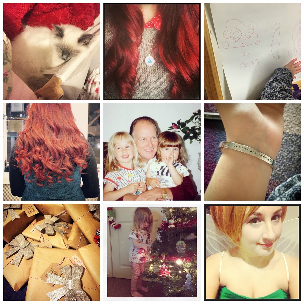
With the end of the year (and end of decade, oh my goodness) in sight i’m obviously starting to evaluate the year across all aspects of my life, including work. Does anyone else does this? I spend the end of the year having a good look at where i’m at before working towards setting new goals for the future. I always want the next year to be better than the last, and the only person who can make that happen is me. Today I’ve been looking back at work, my blog and social media specifically and while I’ve done pretty well, there is always room for improvement.
Every new year I have to renew my hosting and pay for my blog domain and when I do that, I like to spruce up my layout. After a whole year I’m always ready for a chance. Usually I pay someone to do the design aspect for me, and although I always like how it looks, I don’t feel very accomplished. So this year I’m giving it a bash myself, starting with a new blog logo.
I’m one of those people who likes to use their logo across the board, on the blog, social media and on any business cards I get printed so it has to be something I’m happy with. For me, the most important part is of course the font my blog name is in. I use this font in other aspects on my blog layout to pull it all together so it has to be legible, eye catching and encompass what my blog is about. After many years using the fonts that come pre-loaded, I finally found a great website with a load of font free bundles. They’re really easy to download and install too which is a bonus for me as I’m not great at that sort of thing.
So here are my three favourite designs;
![]()
The first font I’ve chosen is called Jullia Script and the reason why it caught my eye is it’s actually quite similar to my own handwriting. I like that as it feels personal and it feels me. At the end of the day it’s my blog so I want to put my own stamp on it. I love that the capitals are bigger than the lower case letters so I was able to pop a little teacup graphic in. My only issue is that I worry the line is too fine and it might not stand out as much as other fonts.
![]()
This font is called Pepper Hands, I like it because it’s still a similar style font as the first but it’s a little bolder and may stand out more as the name of the blog. I like that it has almost got a 3D look to it which I think is eye catching but it’s still got a smooth hand writing feel which fits my blog perfectly. The teacup placement is the same as on the first one but as the font size doesn’t need to be as big due to the thicker lines I’ve also made the image smaller.
![]()
The final font I’ve been experimenting with is Blue Planet. At first I wasn’t so keen. I liked how it looked on the website but when I was playing around with it I didn’t like that all the letters were the same size (where would I put my teacup, guys?!) But once I added the shadow I felt like “this is it!” It stands out, it’s eye catching, it goes with my colour scheme and I was able to incorporate the teacup graphic. This is definitely my favourite style and it’s really different to anything I’ve had in the past.
I feel really positive designing my own logo now and for someone who isn’t that creative, I think I managed to come up with some good ideas.
What do you think? Which one is your favourite?

You May Also Like
February Reads
Weekly Wardrobe — Minnie, Lace & Victorian Boots Oh My!